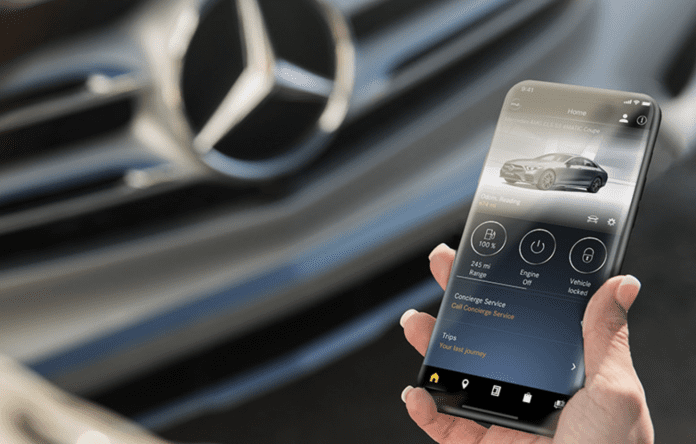
An initial J.D. Power OEM EV App Benchmark Study examined a small segment of tech-savvy consumers who own electric vehicles and asked about their experience with the OEM’s app. Nearly one in three people don’t use the mobile app because they don’t know how it works. Of the 20 most common features found in-app, more than two-thirds would want 15 options, but the survey found that “only eight features are widely available.”
While this covers only a small segment of car owners, the involved demographic should be quite able to navigate a mobile app efficiently. Non-EV apps likely get less traction from car owners yet. And when a mobile app isn’t enjoyed or easily integrated into everyday life, it gets left unused and archived or even deleted.
How it’s relevant to dealership apps
Like an OEM app, there are plenty of reasons to develop and distribute a standalone dealership app. Notifications can retain service customers and provide service reminders, and it’s a simple platform for owners to schedule vehicle service. New model descriptions and features can be disseminated, and financing and lease promotions can be advertised to a targeted audience.
But does your dealership’s mobile app work well? Roughly one-fourth of all apps are used only once. Usually, the user experience falls short of the user’s expectations, and it’s often because the app is clunky and not intuitive. If your customers aren’t using your mobile app, you’re missing easy opportunities for retention and sales, and you’re paying an extra expense while you’re at it.

What consumers want in a mobile app
What does a good dealership mobile app look like, then? First, it needs to be intuitive. When the app is opened, it should show users the main features or categories right away. Every tap should be completed with a sense of engagement rather than confusion. And when the user needs to go back, it should be a no-brainer where to click.
The experience should be focused too. Cluttered screens or poor contrast between text and backgrounds leads to frustration and distracts from the purpose.
Keep your users in-app wherever possible. Avoid leading the user out of the app. It’s tempting to take the easy route and send users to a webpage for resources, but most app users find it annoying to switch back to the app from a browser window.
Most of all, they want value. For example, a contact page to set a service appointment can be frustrating for a customer rather than an integrated calendar to pick a time slot and service advisor. Provide the experience that you’d want as the customer.
How to deal with an underperforming mobile app
Review its functionality if your store’s app doesn’t seem to be generating any value or leads. Have people from outside auto retail go through your mobile app and pick it apart, letting you know where it falls short. Then fix the issues, at least the major ones.
Don’t reinvent the wheel. If you’ve come across a dealership app that hits all the right notes, contact the developer and get a version of it for your store. It’s tempting to find cheaper options, but it comes at a risk of poor UX, and that’s not worth it.
Then, spread the news. Push your mobile app through the parts, service, and sales departments, getting your customers to try it out. A mobile app that’s well done should generate leads for sales and service and provide your clients with retention-inducing value in other ways.
Did you enjoy this article? Please share your thoughts, comments, or questions regarding this topic by connecting with us at newsroom@cbtnews.com.
Be sure to follow us on Facebook, LinkedIn, and TikTok to stay up to date.
While you’re here, don’t forget to subscribe to our email newsletter for all the latest auto industry news from CBT News.


